Who Gives a Serif About Typography?
The State Department’s font change highlights the significance of font choice in web design and digital branding
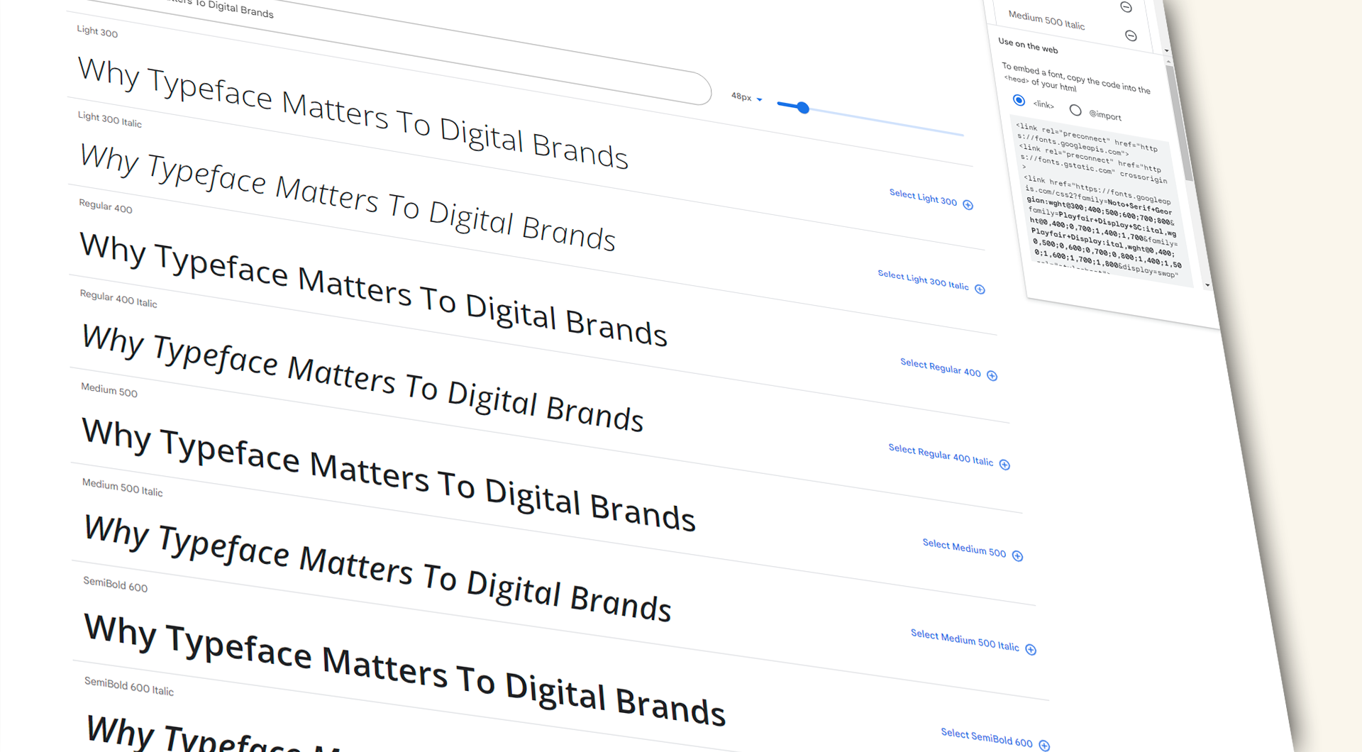
The importance of typeset and font selection in web design and digital branding cannot be overstated.
As evidence, the State Department recently made headlines when it announced a shift from the traditional Times New Roman to Calibri for certain documents. According to a memo, Secretary of State Antony Blinken stated that this change aimed to improve accessibility and readability, especially for individuals with disabilities using Optical Character Recognition technology or screen readers.
The decision underscores the impact font selection can play in enhancing user experience and accessibility. Serif fonts, like Times New Roman, are known for their “wings” and “feet,” which can make small, printed text easier to read and appear authoritative. However, in the digital realm, sans-serif fonts like Calibri are considered more readable on screens. While there are no strict rules regarding font selection, accessibility documents from the University of North Carolina at Greensboro and Penn State concur that sans-serif fonts are generally more screen-friendly.
The State Department’s change sparked considerable discussion, reflecting the strong feelings people have about fonts. This emotional response highlights the impact font selection can have on both the experience of writing and the overall perception of digital content. As web designers and digital marketers, we must recognize that font choice can not only affect readability and accessibility but also influence brand perception and user experience.
In web design and digital branding, the right font selection can set the tone, establish brand identity, and communicate professionalism. For instance, selecting an accessible font can convey a company’s commitment to inclusivity and its consideration for individuals with disabilities. Furthermore, font choice can evoke emotions and associations that impact user engagement, such as trustworthiness, modernity, or creativity.
Ultimately, the State Department’s font change serves as a reminder for web designers and digital marketers to prioritize font selection as a vital aspect of their work. By carefully considering the readability, accessibility, and emotional impact of various fonts, designers can create digital experiences that resonate with users and strengthen brand identity. In a world increasingly reliant on screens for communication, the power of typeset and font selection must not be underestimated.
Return to blog